
Why Enterprise Dashboards Are Challenging?
Enterprise dashboards are powerful but notoriously complex. They pull together huge datasets, multiple KPIs, and diverse user roles, from executives to analysts, who must make decisions quickly and under pressure. Yet, too often, they become sources of frustration. Instead of providing clarity, they cause confusion, slow down decision-making, and are ultimately abandoned. The root of the problem often isn’t the data itself, but how it’s presented.
This is where a concept from educational psychology, Cognitive Load Theory (CLT), becomes an invaluable framework for designing effective and user-friendly enterprise dashboards. If you’re looking for professional help in creating user-friendly dashboards, take a look at our UI/UX design company in Kochi, Kerala.
What is Cognitive Load Theory?
Originally developed by John Sweller, Cognitive Load Theory explains how our working memory, the part of our mind that processes new information, has a limited capacity. CLT breaks down mental effort into three types:
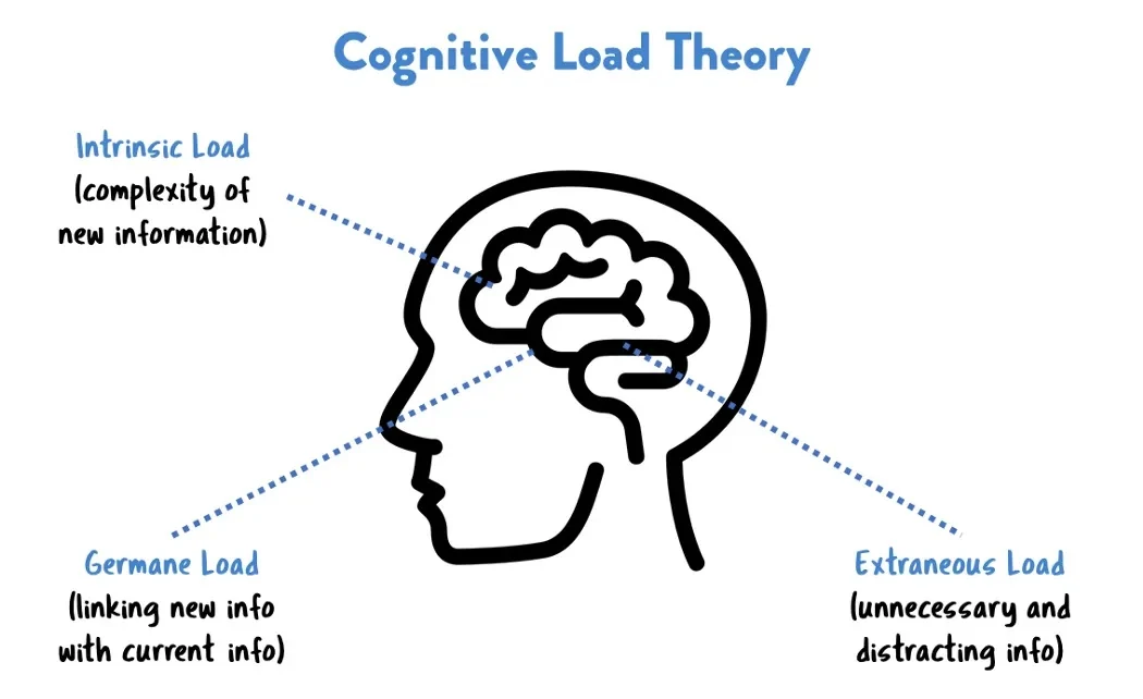
1. Intrinsic Load: The inherent complexity of the data and the task itself (e.g., understanding a complex financial KPI or a massive dataset).
2. Extraneous Load: The mental effort wasted on overcoming poor design. This is caused by a cluttered UI, confusing navigation, or irrelevant elements. This is the load good design aims to eliminate.
3. Germane Load: The productive cognitive effort devoted to deep learning, pattern recognition, and gaining genuine insight. This is the load good design aims to promote.
The thesis is simple! By applying CLT principles, we can minimize extraneous load, manage intrinsic load, and support germane load. The result? Fewer errors, faster decisions, and higher user satisfaction and adoption.
Common UX Problems That Increase Cognitive Load
Many dashboard UX sins directly contribute to unnecessary extraneous load:
- Cluttered interfaces with too many data points or visualizations
- Poor visual hierarchy: Everything is emphasized equally, so nothing stands out
- Inconsistent or confusing navigation and controls
- Overuse of colors, animations, or decorative elements that distract
- No progressive disclosure (showing all details upfront instead of revealing them when needed)
- Limited customization or filtering (forcing user to see irrelevant data)
How to Apply CLT for a Better Dashboard UX?
Here’s how you can actively use Cognitive Load Theory to guide your design choices:
Use Chunking and Modular Layouts: Break the dashboard into logical, digestible sections or modules. Group related metrics together to help users process information in meaningful chunks. This aligns with principles of designing for better UX, where structure helps reduce confusion
Implement Progressive Disclosure: Don’t show everything at once. Hide advanced filters, detailed tables, or secondary metrics behind interactions like “Click to see more” or expandable sections. Reveal detail on demand.
Prioritize a Clear Visual Hierarchy: Use size, color, contrast, and whitespace strategically. The most important metric should be the first thing the eye is drawn to. Guide the user through the data in a logical sequence.
Ensure Consistency: Use standard, predictable UI elements and design patterns. If a blue underlined text is a link on one dashboard, it should be the same on all others. This reduces the learning curve.
Reduce Extraneous Load: Simplify charts. Remove redundant information, decorative elements, and any graphics that don’t directly serve a communicative purpose. Embrace minimalism. This is similar to user-centered design in mobile apps, where minimizing distractions improves engagement and task performance.
Support Germane Load: Facilitate insight by providing clear context. Use precise labels, descriptive titles, and helpful tooltips. The goal is to help the user understand, not just see.
Enable Personalization & Role-Based Views: A C-level executive and a logistics manager need different data. Build dashboards tailored to specific roles, ensuring each user sees only the most relevant and actionable information for their tasks.
A Hypothetical Case Study: The Redesign
Before: A sales dashboard presented 15 charts on one page: yearly revenue, lead conversion rates, regional breakdowns, website traffic sources, and individual salesperson quotas. All used the same chart type and size. Users reported feeling overwhelmed and taking several minutes to find specific answers.
After applying CLT:
- The dashboard was split into three tabs: “Performance Overview,” “Lead Analysis,” and “Team Metrics.”
- The “Overview” tab featured one large key metric (YTD Revenue), a trend chart, and a regional map—clean and scannable in under 10 seconds.
- Detailed breakdowns and filters were moved into expandable sections.
- Colors were used only to highlight significant trends (e.g., red for negative growth).
Result: Users found information over 50% faster, reported higher confidence in the data, and the dashboard saw a significant increase in daily usage.
Tools & Methods to Evaluate Cognitive Load in Dashboards
You can’t improve what you don’t measure. Here are ways to gauge cognitive load:
1. Usability Testing: Observe users as they perform specific tasks. Where do they hesitate? What questions do they ask?
2. A/B Testing: Test two different layouts or visualization styles to see which leads to better performance and preference.
3. Heatmaps & Analytics: Use tools to see where users click and look, revealing what grabs attention and what is ignored.
4. Subjective Feedback: Use surveys or tools like the NASA-TLX questionnaire to ask users directly about their perceived mental effort.
5. Gather Qualitative Feedback: Ask users if they felt confused, overwhelmed, or confident while using the dashboard.
Challenges and Trade-offs in Cognitive Load
Applying CLT isn’t always straightforward. There are trade-offs to consider:
- Simplicity vs. Nuance: Oversimplifying can strip away valuable context and nuance, potentially hiding important insights.
- Novice vs. Power Users: While a simplified view is great for most, power users often need direct access to raw, detailed data. The solution is often a well-designed “drill-down” path.
- Technical Debt: Legacy systems and technical constraints can sometimes limit how much you can change the underlying data structure or UI.
Design for the Mind
Designing enterprise dashboards isn’t just about aesthetics it’s about managing cognitive load! When dashboards respect users’ mental bandwidth, they enable better decisions, faster insights, and higher adoption rates.
The common pitfall of overwhelming users with clutter and poor structure can be effectively addressed through Cognitive Load Theory (CLT). By applying CLT principles—such as chunking, progressive disclosure, clear visual hierarchy, and role-based views—you can minimize distracting elements (extraneous load) and promote meaningful engagement with data (germane load). The result is a dashboard that is not only easier to understand but also more effective at driving action, as demonstrated by case studies where redesigned dashboards led to significantly faster task completion and higher user engagement.
In Summary
To transform your data presentation from overwhelming to insightful, audit your dashboards through the lens of cognitive load. Identify one change to reduce clutter or add context, then iterate and test. For organizations looking to expertly implement these principles, partnering with a experienced UI UX Design agency, like Fegno Technologies, a leading software development company in Kochi, Kerala, can provide the specialized skill set needed to build intuitive, high-impact enterprise dashboard solutions.

UI/UX Designer with 3 years at Fegno Technologies, creating user-focused and visually engaging digital experiences. Skilled in wireframing, prototyping, user research, and design systems, with experience delivering seamless web and mobile solutions in collaboration with developers and clients.

 Schedule An Appointment