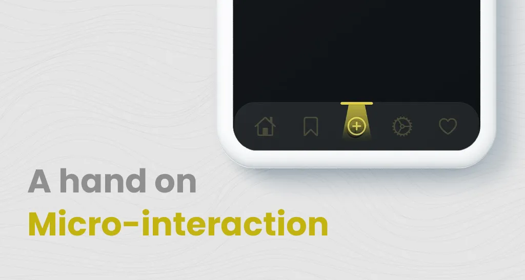
Including micro-interactions in your app always helps your user to be more engaged in the app process, so any app developer should learn a few tricks to keep their users busy while the app is running some heavy tasks, but always remember to keep it subtle.
So I recently saw one such micro-interaction design for a bottom navigation bar in social media and thought of building it in Flutter.
So Let’s Start Building!
Building Bottom Navigation Bar
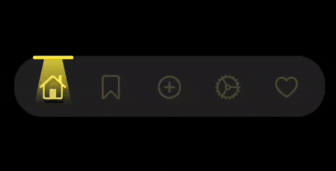
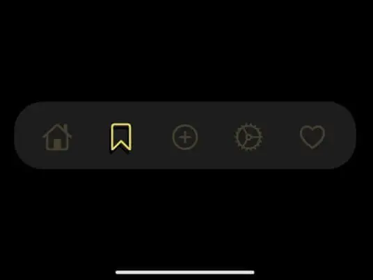
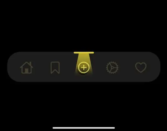
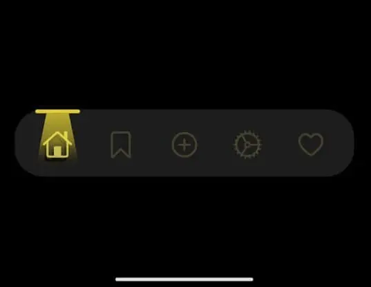
As you can see, this design contains two main parts, one is the bottom navigation icon, which shows a shadow while highlighted, and another is the tube-light-like container on top of the current icon, and when combined, gives a good experience.
Also, the top container moves along the top smoothly, so we have to play with animation a little.
Before going further, to specify the dimensions of each widget and to make it fit in any screens, I have used a method in which I get the screen width and height of the device first and divide it into blocks (let’s say a hundred). So any dimensions are specified in terms of these blocks, rather than giving it a static value. This part is specified in SizeConfig class, and we call it whenever required.
SizeConfig class:
class SizeConfig{static MediaQueryData _mediaQueryData;
static double screenWidth;
static double screenHeight;
static double blockSizeHorizontal;
static double blockSizeVertical;
void init (BuildContext context){
_mediaQueryData=MediaQuery.of(context);
screenWidth =_mediaQueryData.size.width;
screenHeight=_mediaQueryData.size.height;
blockSizeHorizontal=screenWidth/100;
blockSizeVertical=screenHeight/100;
}
}
Now coming back, first build the base container for the navigation bar, give it a necessary padding to make it float. For icons, let’s create a separate class BottomNavButton, where we specify how the icon should behave when clicked. Here we pass a function onPressed to specify on click changes, icon-data for each icon and index of each container, and the index of the current container.
The icon is wrapped using AnimatedOpacity, and the opacity is changed from 1 to 0.2
We need a shadow for the icon that is selected currently, so we use the Positioned widget to the left and bottom to align another icon behind and wrap it in the stack.
BottomNavButton class:
class BottomNavButton extends StatelessWidget {final Function(int) onPressed;
final IconData icon;
final int index;
final int currentIndex;
BottomNavButton({this.icon,this.onPressed,this.index,this.currentIndex, Key key}) : super(key: key);
@override
Widget build(BuildContext context) {
SizeConfig().init(context);
return InkWell(
onTap: (){
onPressed(index);
},
child: Container(
height: SizeConfig.blockSizeHorizontal*13,
width: SizeConfig.blockSizeHorizontal*17,
decoration: BoxDecoration(
color: Colors.transparent,
),
child: Stack(
alignment: Alignment.center,
children: [
(currentIndex == index) ?
Positioned(
left: SizeConfig.blockSizeHorizontal*4,
bottom: SizeConfig.blockSizeHorizontal*1.5,
child: Icon(
icon,
color: Colors.black,
size: SizeConfig.blockSizeHorizontal*8,
),):Container(),
AnimatedOpacity(
opacity: (currentIndex == index) ? 1 : 0.2,
duration: Duration(milliseconds: 300),
curve: Curves.easeIn,
child: Icon(
icon,
color: Colors.yellow[300],
size: SizeConfig.blockSizeHorizontal*8,
),
),
],
),
),
);
}
}
So we have successfully finished the first part, and now we have a bottom navigation bar with icons animated on click, but it’s not completed until we create a tube-light container on top. As you can see from the first image, the light should fade from top to bottom and must have a trapezium shape. So we use the clipper MyCustomClipper, to specify the shape. This clipper is wrapped around the container in which we specify the gradient values from top to bottom.
MyCustomClipper class:
class MyCustomClipper extends CustomClipper {
  @override
  Path getClip(Size size) {
    var path = Path();
    path.lineTo(SizeConfig.blockSizeHorizontal*3, 0);
    path.lineTo(0, size.height);
    path.lineTo(size.width, size.height);
    path.lineTo( size.width - SizeConfig.blockSizeHorizontal*3 , 0);
return path;
}@override
bool shouldReclip(CustomClipper oldClipper) {
return true;
}
}
Now finally we wrap this entire widget with AnimatedPositioned and it is left alignment as per the current index.
Inside HomeScreen class:
AnimatedPositioned(
  duration: Duration(milliseconds: 300),
  curve: Curves.decelerate,
  top: 0,
  left:
  (_currentIndex == 0 ) ? SizeConfig.blockSizeHorizontal*5.5 :
  (_currentIndex == 1 ) ? SizeConfig.blockSizeHorizontal*22.5 :
  (_currentIndex == 2 ) ? SizeConfig.blockSizeHorizontal*39.5 :
  (_currentIndex == 3 ) ? SizeConfig.blockSizeHorizontal*56.5  :
  (_currentIndex == 4 ) ? SizeConfig.blockSizeHorizontal*73.5 : 0,
child: Column(
children: [
Container(
height: SizeConfig.blockSizeHorizontal*1.0,
width: SizeConfig.blockSizeHorizontal*12,
decoration: BoxDecoration(
color: Colors.yellow,
borderRadius: BorderRadius.circular(10),
),
),
ClipPath(
clipper: MyCustomClipper(),
child: Container(
height: SizeConfig.blockSizeHorizontal*15,
width: SizeConfig.blockSizeHorizontal*12,
decoration: BoxDecoration(
gradient: LinearGradient(
begin: Alignment.topCenter,
end: Alignment.bottomCenter,
colors: [
Colors.yellow.withOpacity(0.8),
Colors.yellow.withOpacity(0.5),
Colors.transparent
]
)
),
),
),
],
)
)And that’s it !! We have successfully built our bottom navigation bar, and it will look like this:
You can check the source code here: Bitbucket-Stuart
Head of Development at Fegno Technologies, with 12+ years of experience in product engineering. A specialist in technical architecture and UI/UX, he leads teams to build scalable, high-performance digital solutions.

 Schedule An Appointment